Modernising the digital presence of the Orchestra, creating engaging and delightful customer experiences whilst best showcasing the rebranding of the SSO, positioning them as a leader and a key resource of the Performing Arts industry.
Award-winning Experience & UI Designer based in Melbourne, Australia.
Working on projects locally and globally. Start a conversation now.
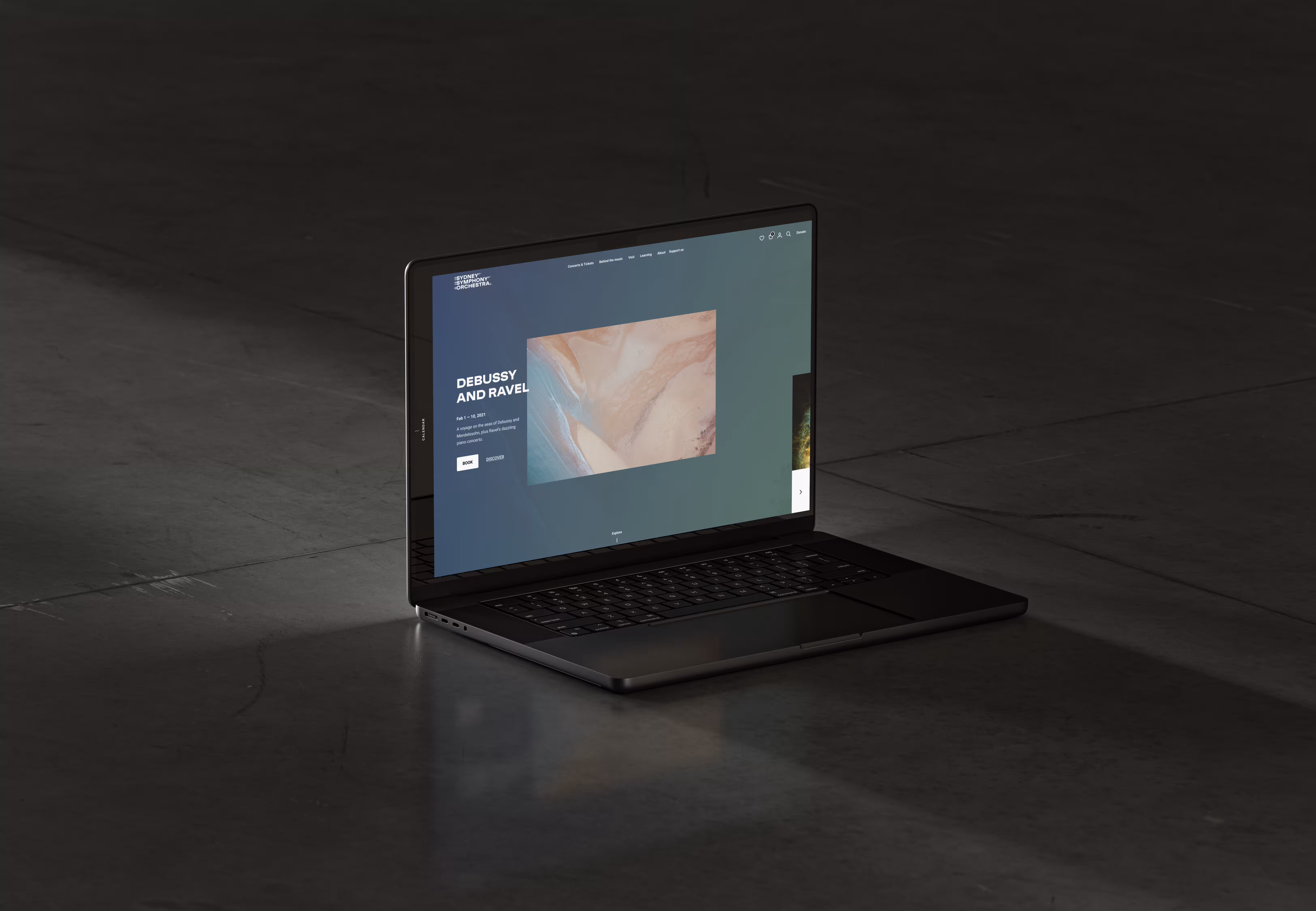
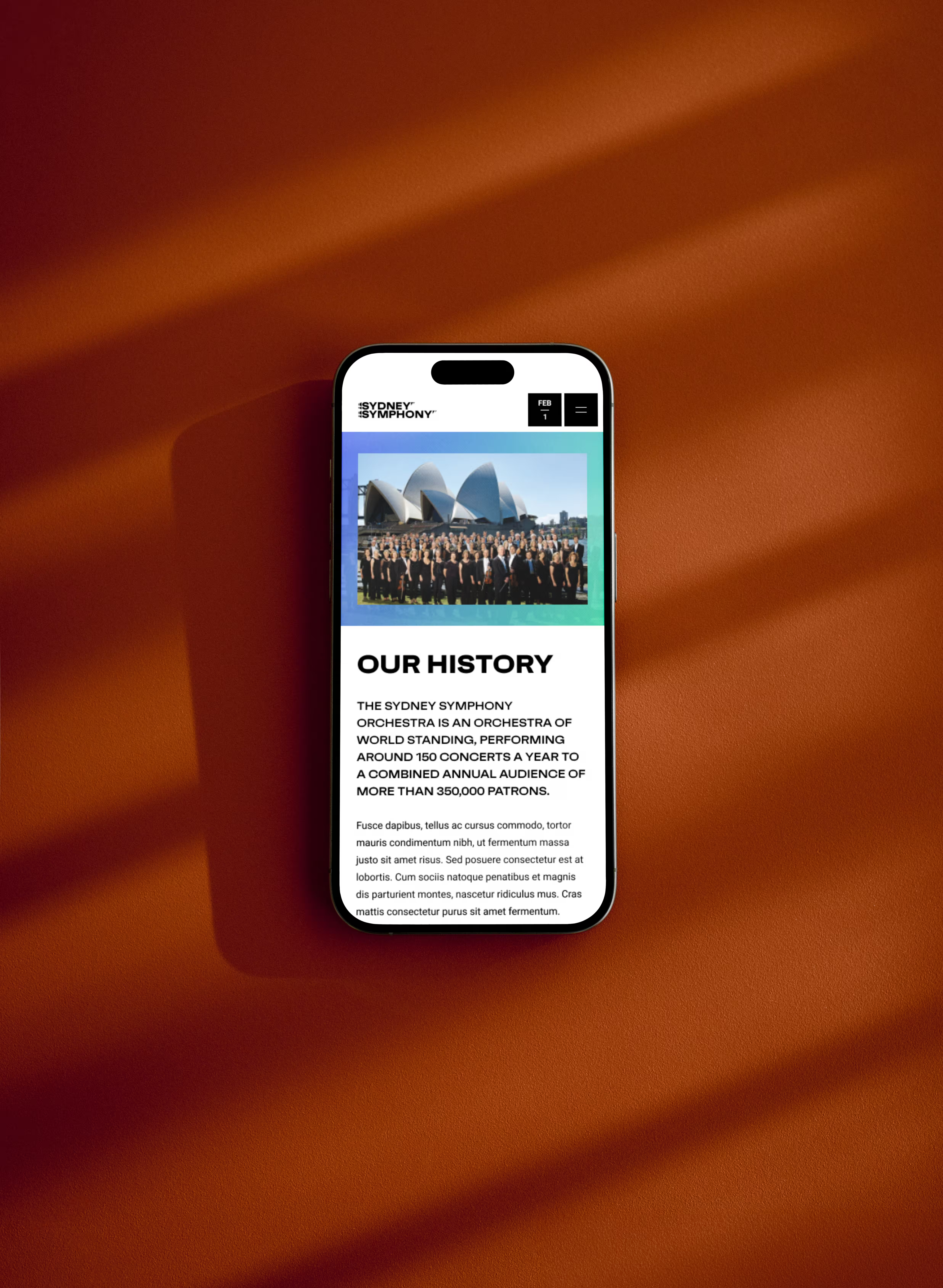
The Sydney Symphony Orchestra (SSO) is a true Australian cultural institution that has brought the gift of music and inspired generations in Australia and across the world since 1932.
Role
Lead UX/UI & interactions designer
Client
Sydney Symphony Orchestra
Agency
Carter / Wongdoody
Recognitions
Fast Company - 2022 APAC Innovation by design award
Webby award - 2022 nominee

[Challenge]
Modernising the digital presence of the Orchestra, creating engaging and delightful customer experiences whilst best showcasing the rebranding of the SSO, positioning them as a leader and a key resource of the Performing Arts industry.
[Approach]
With our internal and client teams all working from home, adapting our workflows without compromising quality was our first priority. Virtual workshops to gather requirements from stakeholders as well as audience data and analysis were set in place. And (my kitchen) walls got covered in sticky notes to create user journeys.
Once we moved on from research with our minimum viable product requirements, as well as the additional components that would fit our timeline and capabilities, our team allowed itself to get messy on the sketchpads, sharing ideas and drawings until we had our general ideas for layouts, navigation and general experience on the site.
After creating the critical parts of the experience in prototypes, we used online testing tools to place it in the hands of users. Following the results of the testing sessions, we iterated on our layouts to craft the most accessible, engaging, audience-first experience for the Orchestra.


[Outcome]
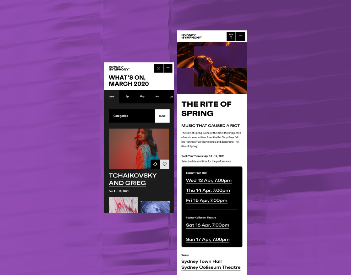
Following the layouts resulting of our UX research and execution, we created a full design system that best showcase the new brand identity of the Sydney Symphony Orchestra.
Using micro-interactions and optical effects to further elevate the user experience to a level that would bring the experience of the orchestra a few steps closer to home and generate engagement in anticipation of the moment we would be able to attend venues again.
The result is a fully editable, modular website, thought for mobile devices first then built upon its strengths on larger desktop screens. Delivered with a simple and accessible CMS structure that allows the SSO team to experiment but also efficiently manage the platform and preparing for the return of the audience into its legendary venues.
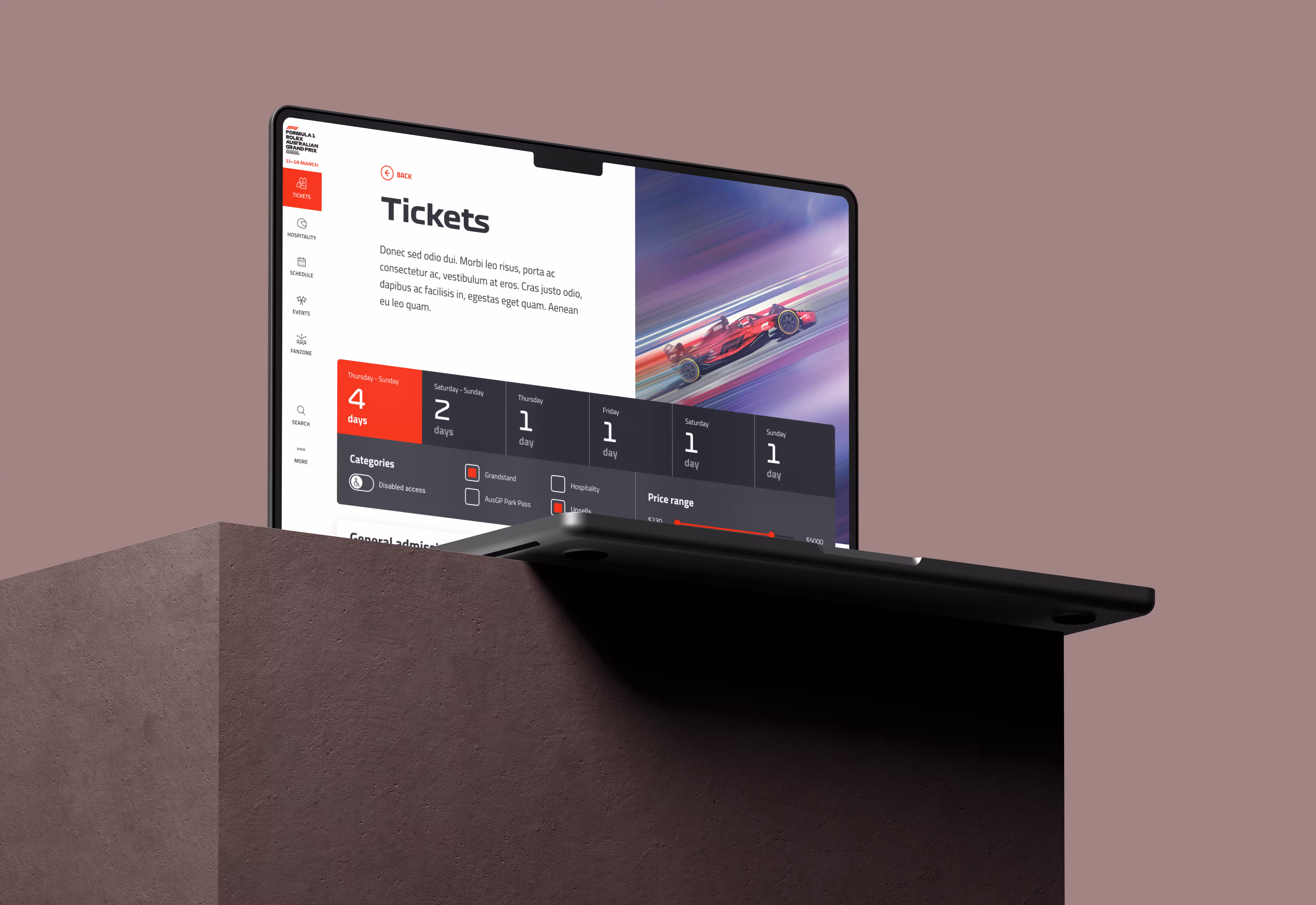
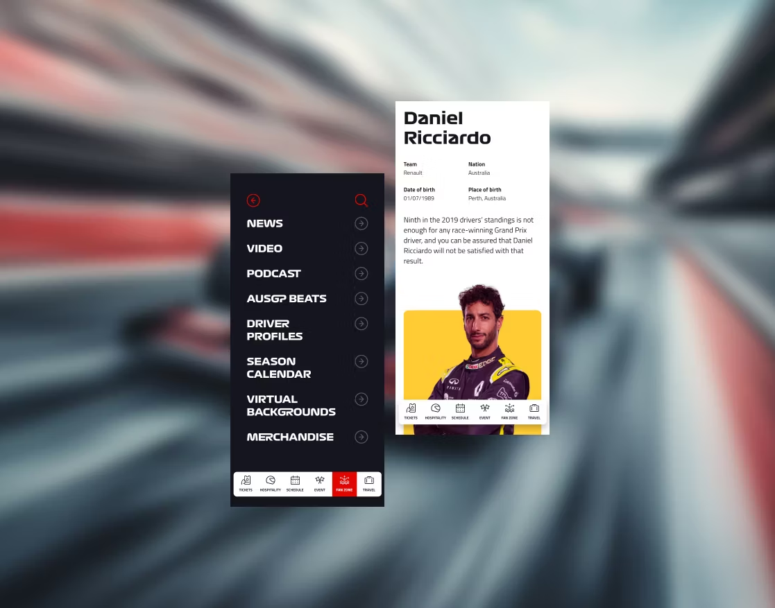
Revitalising and renew interest into both the Formula 1 GP and the Moto GP through mirrored websites that would not only attract and convert new customers, but also satisfy the fans across the world that look forward to the event each year.
Role
Lead UX/UI & interactions designer
Client
Australian Grand Prix Corporation
Agency
Carter / Wongdoody
Recognitions
Webby awards - 2021 winner
Australian Design Awards - DrivenXDesign 2022 Gold winner
Melbourne Design Awards - Better Futures 2022 Gold winner
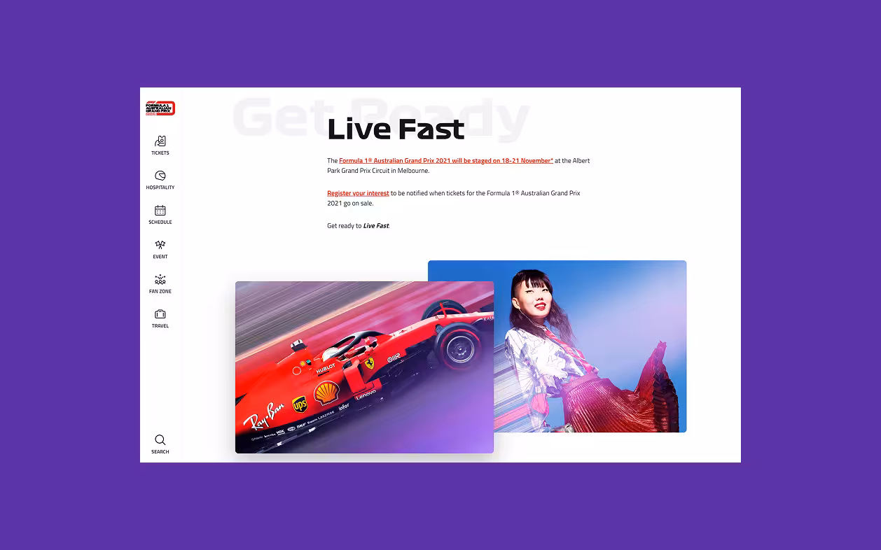
[Challenge]
With the global pandemic striking people and businesses across the world, we pushed forward with AGPC to prepare a platform that would best have them ready for the moment the world would reopen.
[Approach]
Starting with a series of workshop to gather requirements about both projects (F1 and Moto) and get a better understanding of the business needs. We moved forward using the existing research and data available to us and provided by our client partner. Internal workshops allowed us to discover and define what needed to appear on the platforms and draft a flexible information architecture for both.
It was then time to get messy and draft layouts on paper, using our research insights to give shape to the experience.
Through iterations and collaboration, once the team felt comfortable with the general idea of the layouts and designs we created a full suite of wireframes to bring the final touches back into a focus and in a presentable shape to get back to AGPC and refine the UX layouts with them onboard.


[Outcome]
We crafted an experience thought for mobile devices that would be enhanced on larger desktop screens, focusing our efforts on highlighting the experience and rush of a Grand Prix, whilst providing an accessible, simple navigation system to our various audiences.
A modular design system that can adapt to both Formula 1 GP and Moto GP brands was assembled and delivered along with an intuitive CMS experience, allowing our client to quickly and easily populate, maintain and prepare content for the seasons to come.
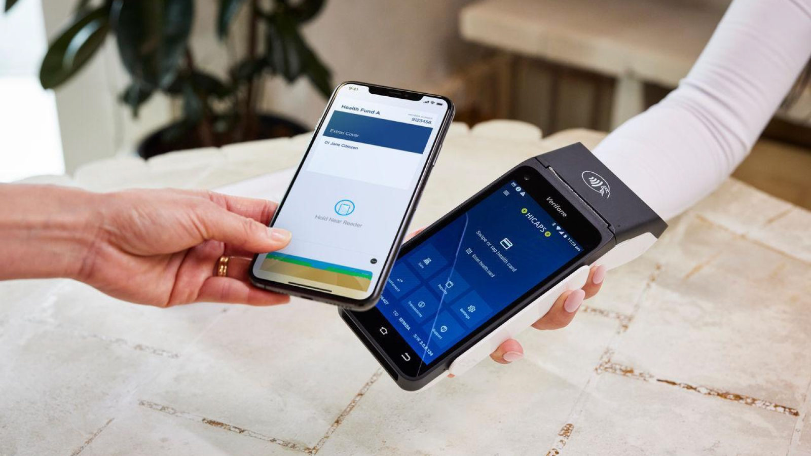
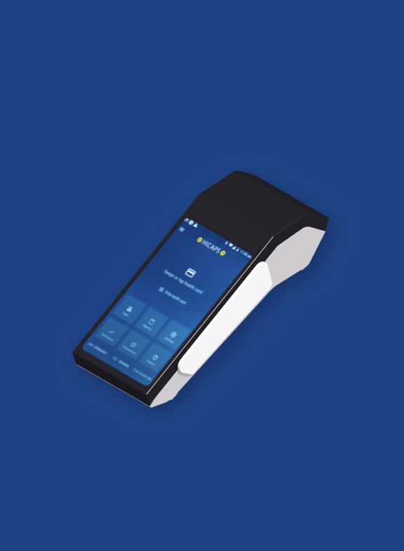
The now-previous generation of HICAPS terminal was going to become non compliant in the near future and the organisation was looking to replace the terminal with new hardware. This gave HICAPS the opportunity to reimagine their digital product offering.
Role
Lead UX/UI consultant
Client
NAB
Agency
Bound
Recognitions

[Challenge]
The Hicaps Terminal Replacement Project aimed to redesign and replace the existing payment terminals used in Australian healthcare facilities. The project's objective was to improve the user experience for both patients and healthcare providers, streamline payment processes, and enhance overall satisfaction and efficiency within the healthcare payment system.
[Approach]
We conducted extensive user research to understand the pain points,needs, and expectations of both patients and healthcare providers during the payment process. The research methods included interviews with multiple user types (patients, healthcare providers and admin staff), observation of the existing fleet in use in healthcare facilities and stakeholder interviews with the customer service team.
The project team collaborated to brainstorm innovative solutions to address the identified pain points and improve the overall payment experience. This phase involved wireframing and prototyping various design concepts. We improved the Information Architecture to create a clear and logical structure that would feel intuitive.

[Outcome]
Through desining the new interface, we created an experience that allows health centers and professionals to focus on patient care and less on admin tasks. One of the greatest challenges was the seamless integration of rebates from private healthcare as well as Medicare, all of which are built in different ways and operate and different architectures.
But truly, a personal highlight on this project was getting to partner with Vision Australia to put the terminal in the hands of people with low vision or blindness and learn many insights about their daily routines and challenges when using this type of devices in a public space.
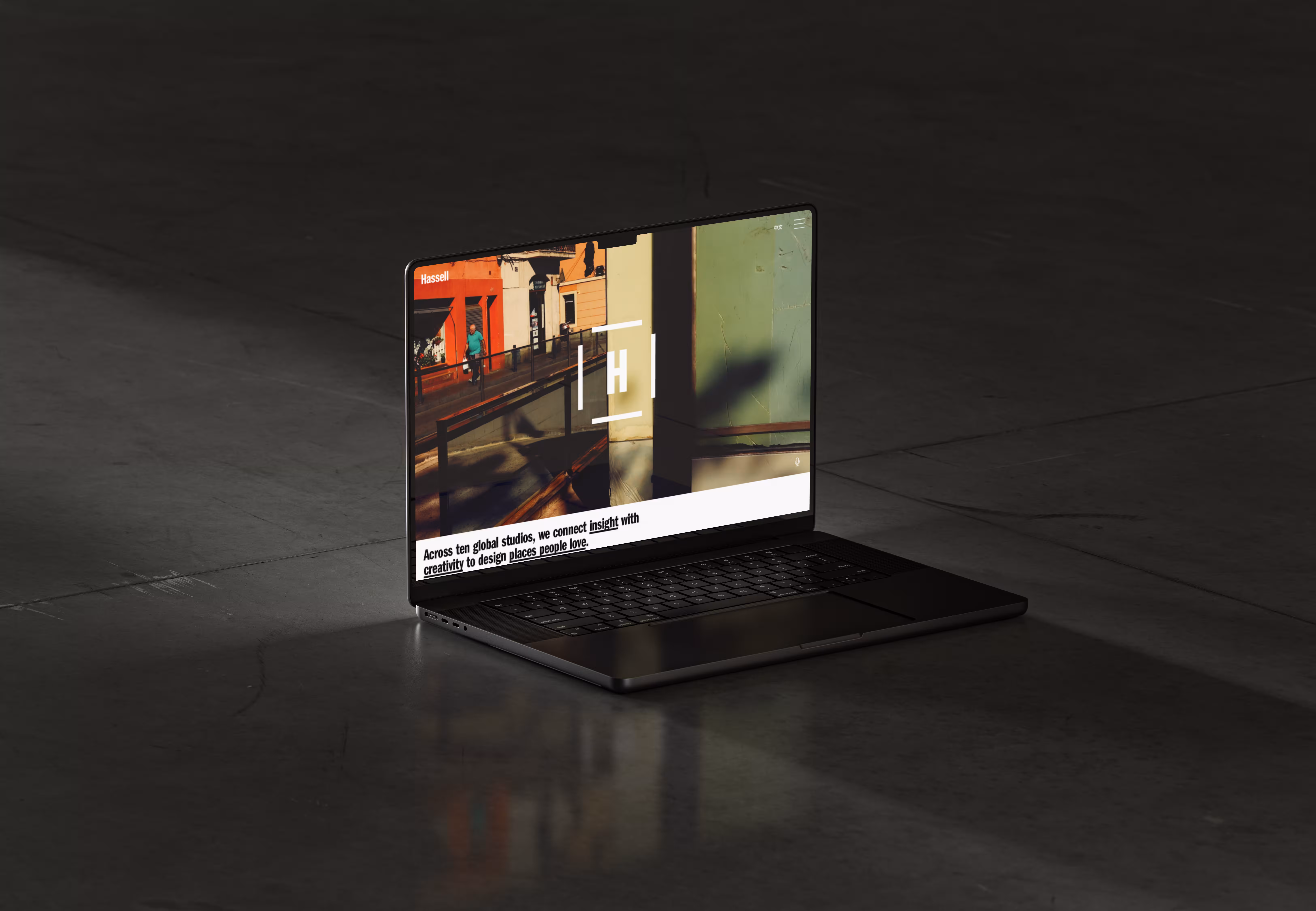
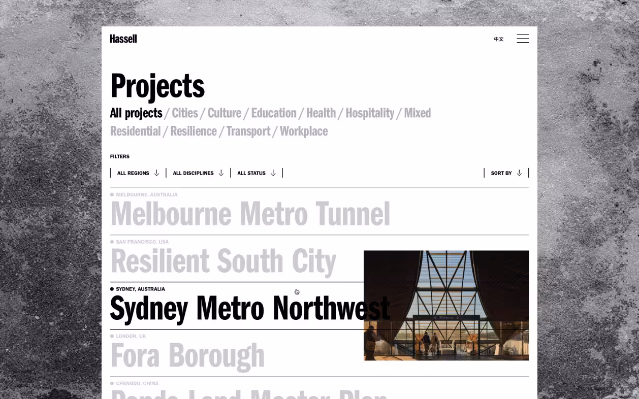
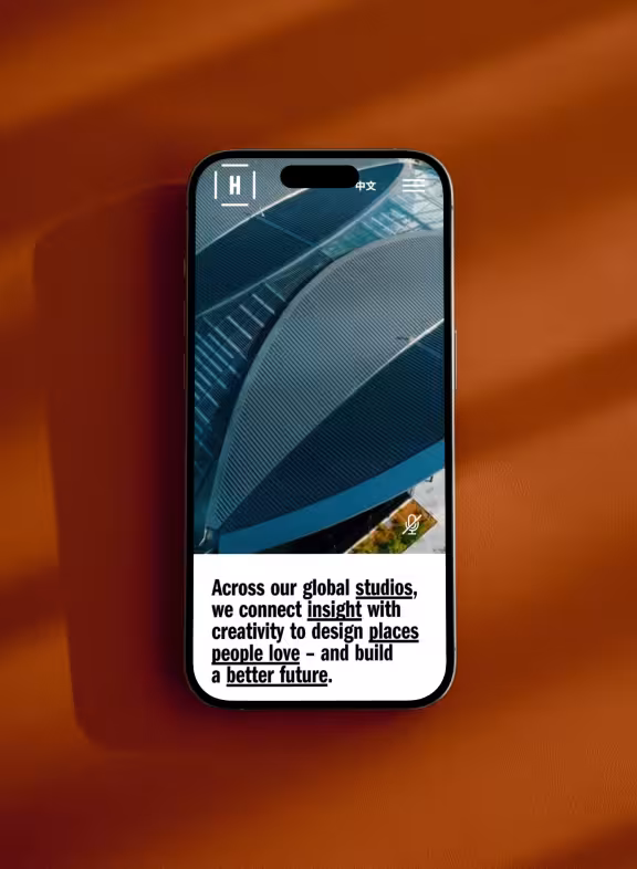
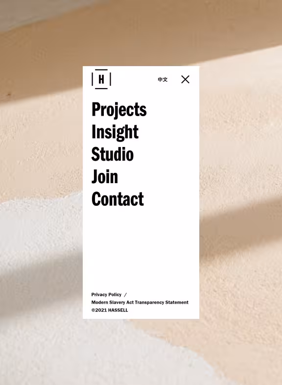
A global leader for innovation and experiential designs in the Architectural world, Hassel Studios approached our team with the task to bring a similar level of impactful and experiential design to their digital representation.
Role
Lead UX/UI designer
Client
Hassell Studios
Agency
Carter / Wongdoody
Recognitions
Webby award - 2022 nominee
[Challenge]
Our expertise and ethos of designing for people first, focusing on human-centred solutions aligned perfectly with Hassell’s own vision and morals. Three main actors took place in this project between the client team, the branding agency in charge of the evolution of Hassell’s new global identity and our team, bringing the digital experience to people across the world whilst integrating the new visual impact of the freshly minted branding.
[Approach]
Multiple workshops took place to progressively frame the project. Starting from a general understanding of the company and the main features that would appear on the site, to progressively frame in detail each branch of the company and its intricacies to help us prioritise and organise the content.
The team went through numerous iterations and possible solutions, allowing ourselves to quickly test, fail, try something different, almost succeed and finally arrive to a successful result.
With changing teams and so many actors in the project, it was essential to keep all communication channels open and transparent to ensure a shared understanding and ownership of the project. More often than not for projects of such span, we made sure to always bring back users at the centre of the conversation and made sure that the design decisions were taken from a human-centred perspective.
[Outcome]
A final product that would be accessible to an international audience, be displayed in different languages and elevate the branding and amazing work of the company on digital.
Our team delivered an elaborated and flexible design system, describing branding integration through typography, use of imagery, micro-interactions and rich layouts.

One Thrive Tribe freshly composed product team reached out to us to help them define, shape, and find the right fit for the idea they were getting ready to explore across the vast wellness sector.
Role
Lead UX/UI consultant
Client
One Thrive Tribe
Agency
Bound
Recognitions

[Challenge]
Aiming not at one specialised area, but all pillars of wellness and wellbeing for qualified content creators. The lean team we assembled immediately set out to work with no time to waste. Together, we set out a plan to define the product and understand both of its audiences.
[Approach]
Running in parallel interviews, diary studies, and focus groups over a couple of weeks we gathered enough insights to establish realistic personas, existing vs ideal journeys, core features, and guiding design principles for the product.
From there, it was time to get our hands dirty, with a divide and conquer mentality where the product and it’s surrounding marketing materials were being designed in parallels with the new branding. With lots of juggling and constant communication, the whole team pulled through to establish the foundations of the product.
With the core features going through development, we decided on launching the product in Beta phase to recruit early content creators and gather their feedback, both through direct communications, and an embedded share back functionality on every single section of the product.


[Outcome]
This Beta phase approach allowed us to not only fail and iterate quickly to improve the product daily, the team was able to validate the concept further and recruit more permanent team members to grow our capabilities. With a larger team now launched at full speed and a full release ahead, the product has grown in every possible aspect and is ready to be received in the world.
Thanks to a sprint-based workflow, and good people encouraging the team from the Beta, we were able to bring the necessary improvements and provide the dynamic setting to ensure it’s continuous improvements and success over the years to come.
Over 13 years of experience in end-to-end digital design work, bringing stories to life with amazing teams of talented people. Crafting scalable and lasting systems that simply feel right when used.
A strong believer in a multi-faceted approach of digital and interactive design, and crafting experiences that just feel right. Aiming to keep the web an interesting and fun place to engage with.
Passionate about designing for people, experiences that feel effortless and interesting.
Blending design and creative development to create memorable moments of visual storytelling.

Fast Company - 2022 APAC Innovation by design award
Sydney Symphony Orchestra
Lead UX/UI & interactions designer
Webby award - 2022 nominee
Sydney Symphony Orchestra
Lead UX/UI & interactions designer
Webby award - 2022 nominee
Hassell Studios
Lead UX/UI designer
Webby awards - 2021 winner
Australian Grand Prix
Lead UX/UI & interactions designer
Australian Design Awards - DrivenXDesign 2022 Gold winner
Australian Grand Prix
Lead UX/UI & interactions designer
Melbourne Design Awards - Better Futures 2022 Gold winner
Australian Grand Prix
Lead UX/UI & interactions designer
Awwwards - Honorable mention
Portfolio 2024
Design, 3D, and Webflow build
Have a project in mind?Need an extra pair of hands to get the job done?
An exciting idea you want to butt heads about?
Drop a message and let’s talk.
Design and dev by Tom Corneteau
As I live and work on the land of the Wurundjeri People of the Kulin Nation, I pay my respect to their Elders past, present and emerging. Acknowledging, and respecting their cultures and heritage, and recognising the continuing sovereignty of all Aboriginal and Torres Strait Islander Nations.
©2025